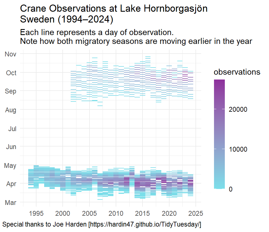
This plot demonstrates how cranes at a specific lake in Sweden are changing the time of their migration year over year.
While creating this plot, I referenced material from a Tidy Tuesday creator. This allowed me to build an understanding of how to use the geom_segment function effectively.
A key challenge here was formating date data in a way that would generate a proper graph:
cranes <- cranes |> mutate(
  md = make_date(year = 2000, month = month(ymd), day = day(ymd)))
In future projects I hope to continue improving my use of the mutate function as it is incredibly powerful.

Complete script used to create the above graph:
library("tidyverse")

cranes <- readr::read_csv('https://raw.githubusercontent.com/rfordatascience/tidytuesday/main/data/2025/2025-09-30/cranes.csv')

#clean data
cranes$ymd <- ymd(cranes$date)
cranes <- cranes |> filter(!is.na(observations))
cranes$year <- year(cranes$ymd)

#create month/day data for ggplot
cranes <- cranes |> mutate(
  md = make_date(year = 2000, month = month(ymd), day = day(ymd)))

#plot

ggplot(cranes, aes(x = year, y = md, color = observations)) +
   geom_segment(aes(
           x = year + 0.5,
           xend = year - 0.5,
           y = md,
           yend = md
         )) +
  scale_color_gradient(low = "#7BDFEA", high = "#8E309C") +
  guides(color = guide_colorbar(
    direction = "vertical",
    barwidth = 1,
    barheight = 10,
    title.position = "top")) +
  theme_minimal() +
  scale_x_continuous(breaks = (seq(1995, 2025, by = 5))) +
  scale_y_date(
    breaks = ymd(c(
      "2000-03-01", "2000-04-01", "2000-05-01",
      "2000-06-01", "2000-07-01", "2000-08-01",
      "2000-09-01", "2000-10-01", "2000-11-01")),
    date_labels = "%b") +
  labs(title = "Crane Observations at Lake Hornborgasjön, Sweden (1994–2024)",
       subtitle = "Each line represents a day of observation.\nNote how both migratory seasons are moving earlier in the year",
       caption = "Special thanks to Joe Harden [https://hardin47.github.io/TidyTuesday/]",
       x = NULL,
       y = NULL)