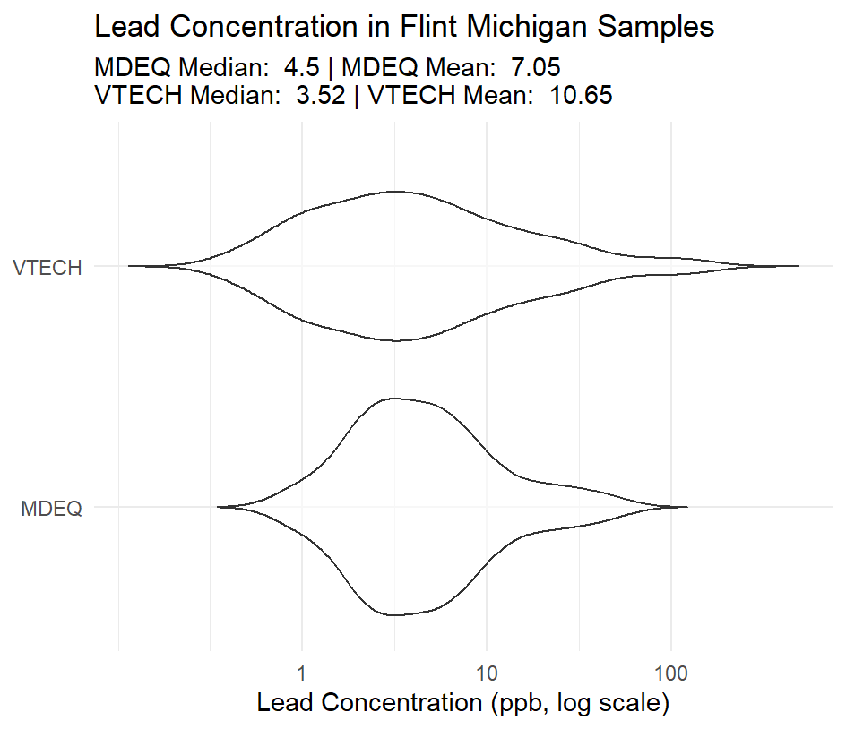
This project uses data gathered by the Michigan department of environmental quality and Virginia Tech. My personal goal with this project was to implement a new type of plot (violin) and to improve my labeling clarity.
This plot uses a logarithmic scale to keep the plot in a form that can be read at a glance:
 scale_y_log10(
        breaks = c(0.01, 1, 10, 100),
        labels = c("0", "1", "10", "100")) +

Below is the full code for this plot:
  library(tidyverse)

  #import data

  flint_mdeq <- readr::read_csv('https://raw.githubusercontent.com/rfordatascience/tidytuesday/main/data/2025/2025-11-04/flint_mdeq.csv')
  flint_vt <- readr::read_csv('https://raw.githubusercontent.com/rfordatascience/tidytuesday/main/data/2025/2025-11-04/flint_vt.csv')

  #clean mdeq data and combine

  flint_mdeq <- filter(flint_mdeq, is.na(notes))
  flint_mdeq <- select(flint_mdeq, -c(notes, lead2))

  flint <- bind_rows(flint_mdeq |> mutate(source = "MDEQ"), flint_vt |> mutate(source = "VTECH"))

  flint <- flint |> filter(lead > 0)

  #find mean and median for both data sets

  stats <- flint |>
    group_by(source) |>
    summarize(median_lead = median(lead),
    mean_lead = mean(lead))

  #create subtitle

  subtitle <- paste(
   "MDEQ Median: ", round(stats$median_lead[stats$source == "MDEQ"], 2),
   "| MDEQ Mean: ", round(stats$mean_lead[stats$source == "MDEQ"], 2),
   "\nVTECH Median: ", round(stats$median_lead[stats$source == "VTECH"], 2),
   "| VTECH Mean: ", round(stats$mean_lead[stats$source == "VTECH"], 2)
  )

  #plot

  ggplot(flint, aes(x = source, y = lead + 0.01)) +
      geom_violin(trim = FALSE, alpha = 0.6) +
      coord_flip() +
      scale_y_log10(
        breaks = c(0.01, 1, 10, 100),
        labels = c("0", "1", "10", "100")) +
      labs(
        title = "Lead Concentration in Flint Michigan Samples",
        subtitle = subtitle,
        x = NULL,
        y = "Lead Concentration (ppb, log scale)") +
      theme_minimal()