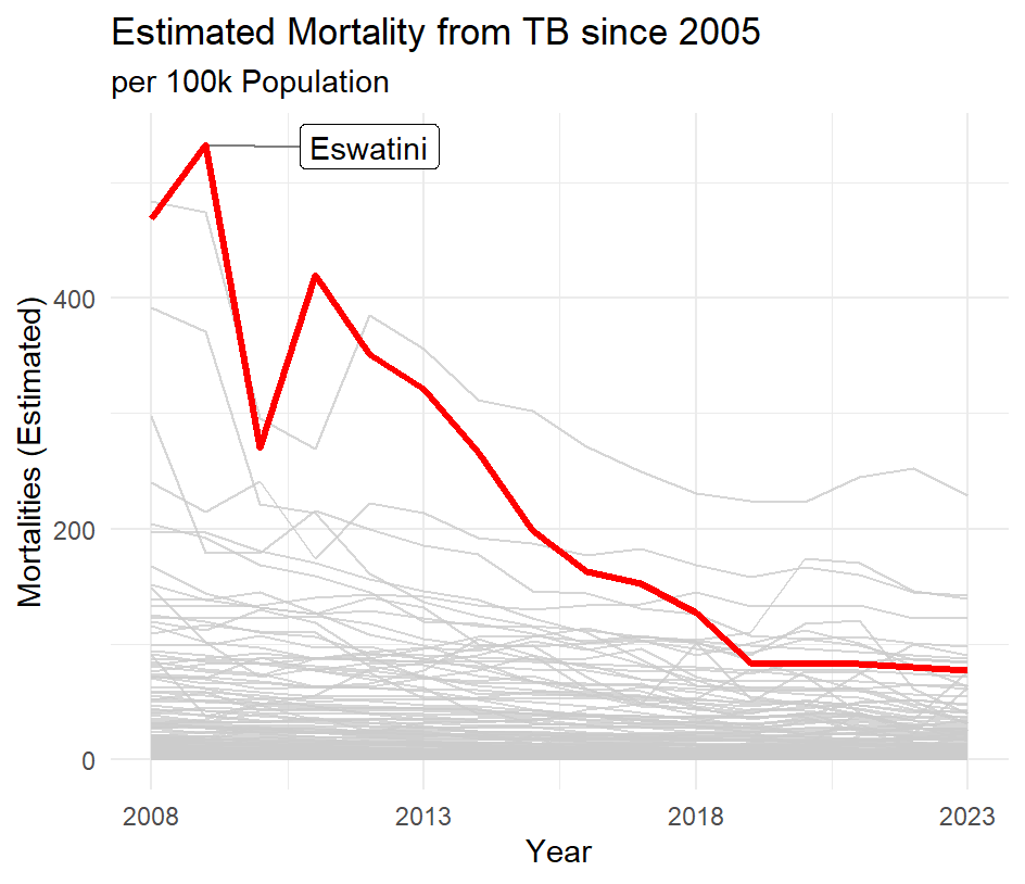
In this plot I chose to create lines showing the estimate mortality rate from all countries since 2008. After generating this, I noted Eswatini as a line of interest, and emphasized it using color and label.
This project is my first time using the ggrepel() function, and I will be continuing to learn with it as I found it very useful, as shown below:
geom_label_repel(
    data = label,
    aes(label = country, y = e_mort_100k, x = year),
    nudge_x = 3,
    segment.colour = "grey50",
    segment.size = 0.5,
    min.segment.length = 0,
    segment.alpha = 1,
    force = 5
 Below is the full code for this plot:
library(tidyverse)
library(ggrepel)

who_tb_data <- readr::read_csv('https://raw.githubusercontent.com/rfordatascience/tidytuesday/main/data/2025/2025-11-11/who_tb_data.csv')

label <- who_tb_data %>%
  filter(country == "Eswatini", year == 2009)

who_tb_data %>%
  filter(year >= 2008, !is.na(e_mort_100k)) %>%
ggplot(aes(x = year , y = e_mort_100k, group = country,)) +
  geom_line(color = "grey80", alpha = 0.8) +
  geom_line(data = filter(who_tb_data, country == "Eswatini"), aes(x = year, y = e_mort_100k), color = "red", linewidth = 1.2) +
  scale_x_continuous(limits = c(2008, 2023), breaks = c(2008, 2013, 2018, 2023)) +
  geom_label_repel(
    data = label,
    aes(label = country, y = e_mort_100k, x = year),
    nudge_x = 3,
    segment.colour = "grey50",
    segment.size = 0.5,
    min.segment.length = 0,
    segment.alpha = 1,
    force = 5
  ) +
  labs(title = "Estimated Mortality from TB since 2005", subtitle = "per 100k Population", x = "Year", y = "Mortalities (Estimated)") +
  theme_minimal()