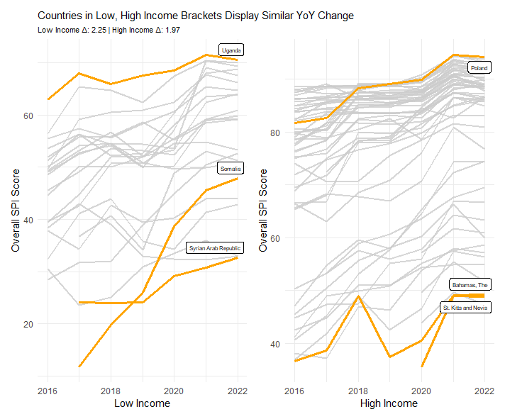
The World Bank Group measures Statistical Performance Indicators (SPI) by testing how well countries manage data. Interestingly, both low and high income countries are improving their data usage at similar rates. This plot utilizes some math to calculate the YoY change average for both low and high income blocks.
avg_delta <- spi %>%
  group_by(country) %>%
  arrange(year) %>%
  summarize(delta = mean(diff(overall_score) / diff(year), na.rm = TRUE)) %>%
  summarize(mean_delta = mean(delta, na.rm = TRUE))
Also new here is the use of library(patchwork) to combine two plots together with p1 + p2
 Below is the full code for this project:
library(tidyverse)
library(ggrepel)
library(patchwork)
library(glue)

# Gather data
spi <- readr::read_csv('https://raw.githubusercontent.com/rfordatascience/tidytuesday/main/data/2025/2025-11-25/spi_indicators.csv')
spi2 <- readr::read_csv('https://raw.githubusercontent.com/rfordatascience/tidytuesday/main/data/2025/2025-11-25/spi_indicators.csv')

#Filter both plots by income, and mark out lines of interest
spi <- filter(spi, income == "Low income", year <= 2022)
color <- spi %>%
  filter(country %in% c("Syrian Arab Republic", "Somalia", "Uganda"))
labels <- filter(color, year == max(year))

spi2 <- filter(spi2, income == "High income", year <= 2022)
color2 <- spi2 %>%
  filter(country %in% c("St. Kitts and Nevis", "Poland", "Bahamas, The"))
labels2 <- filter(color2, year == max(year))

#Calculate average yearly change for both plots
avg_delta <- spi %>%
  group_by(country) %>%
  arrange(year) %>%
  summarize(delta = mean(diff(overall_score) / diff(year), na.rm = TRUE)) %>%
  summarize(mean_delta = mean(delta, na.rm = TRUE))

avg_delta2 <- spi2 %>%
  group_by(country) %>%
  arrange(year) %>%
  summarize(delta = mean(diff(overall_score) / diff(year), na.rm = TRUE)) %>%
  summarize(mean_delta = mean(delta, na.rm = TRUE))

#Create subtitle
subtitle_text <- glue("Low Income Δ: {round(avg_delta, 2)} | High Income Δ: {round(avg_delta2, 2)}")

#Plot low income countries
p1 <- ggplot(data = spi, aes(x = year, y = overall_score, group = country)) +
  geom_line(color = "grey80", alpha = 0.8, linewidth = 0.8) +
  geom_line(data = color, color = "orange", linewidth = 1.1) +
  scale_x_continuous(limits = c(2016, 2022)) +
  theme_minimal() +
  theme(plot.title = element_text(size = 11), plot.subtitle = element_text(size = 8)) +
  geom_label_repel(data = labels,
    aes(label = country, y = overall_score, x= year),
    direction = "y",
    nudge_y = 1,
    size = 2) +
  labs(
    title = "Countries in Low, High Income Brackets Display Similar YoY Change",
    subtitle = subtitle_text,
    x = "Low Income",
    y = "Overall SPI Score"
  )

#Plot high income countries
p2 <- ggplot(data = spi2, aes(x = year, y = overall_score, group = country)) +
  geom_line(color = "grey80", alpha = 0.8, linewidth = 0.8) +
  geom_line(data = color2, color = "orange", linewidth = 1.1) +
  scale_x_continuous(limits = c(2016, 2022)) +
  theme_minimal() +
  geom_label_repel(data = labels2,
                   aes(label = country, y = overall_score, x= year),
                   direction = "y",
                   nudge_y = -1,
                   size = 2) +
  labs(
    x = "High Income",
    y = "Overall SPI Score"
  )

#Combine plots
p1 + p2